Ana Rugina
Graphic Designer
Rotterdam, NL
︎︎︎ About me
︎︎︎ LinkedIn
︎︎︎ Email
︎︎︎ Instagram
Graphic Designer
Rotterdam, NL
We Are One
2022, motion graphicsWhile learning how to use After Effects, I
created a short shape animation which complements the song “We Are One” by
Daddy Was a Milkman.
I thought about the motion graphics in the context of storytelling and synchronized the visuals with the lyrics. Even if this is an older project, it still holds a special place in my heart because it was one of the first times I used motion graphics for something more complex. I would like to create more of this.
I thought about the motion graphics in the context of storytelling and synchronized the visuals with the lyrics. Even if this is an older project, it still holds a special place in my heart because it was one of the first times I used motion graphics for something more complex. I would like to create more of this.
The Not-Yet
2023, hybrid publication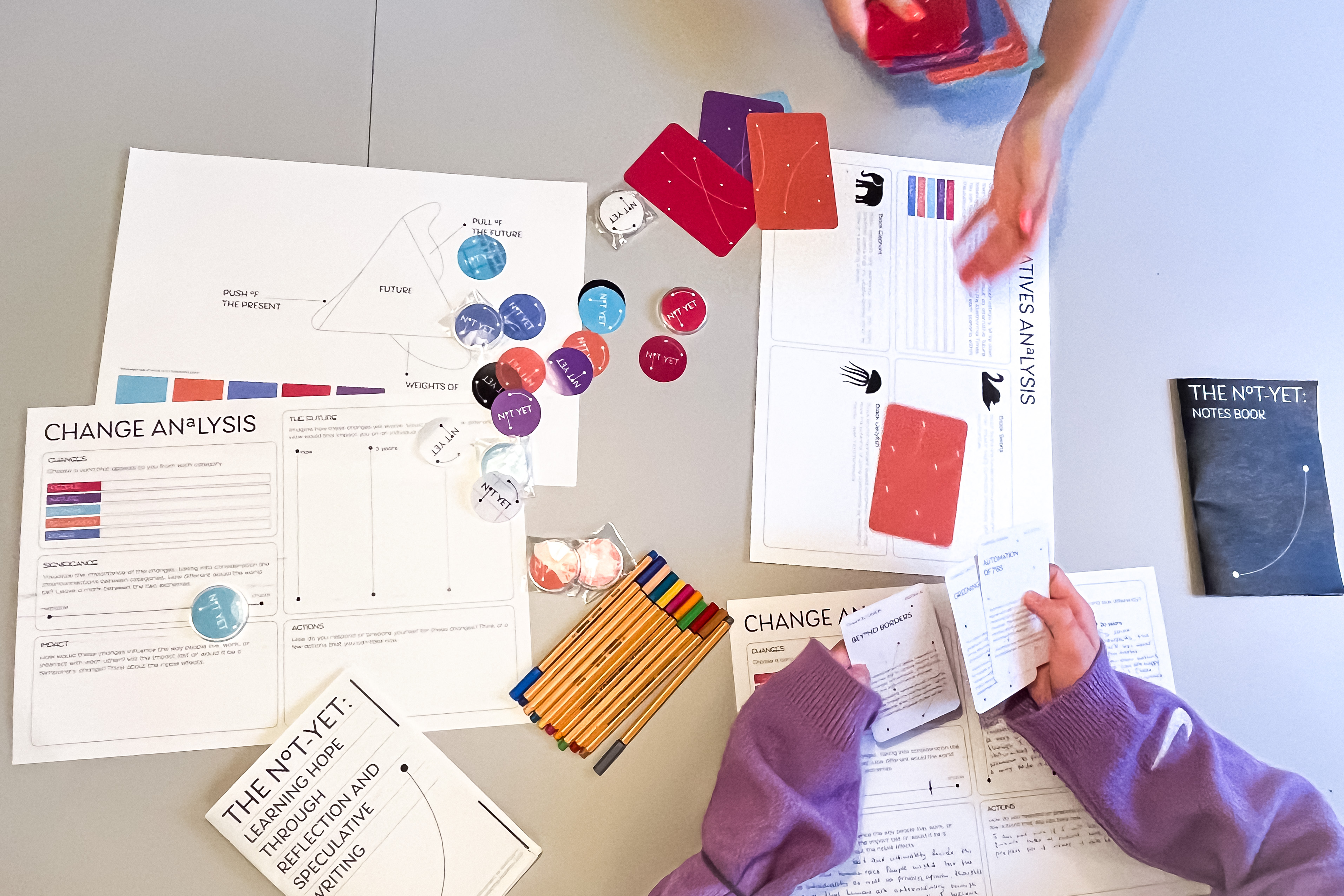
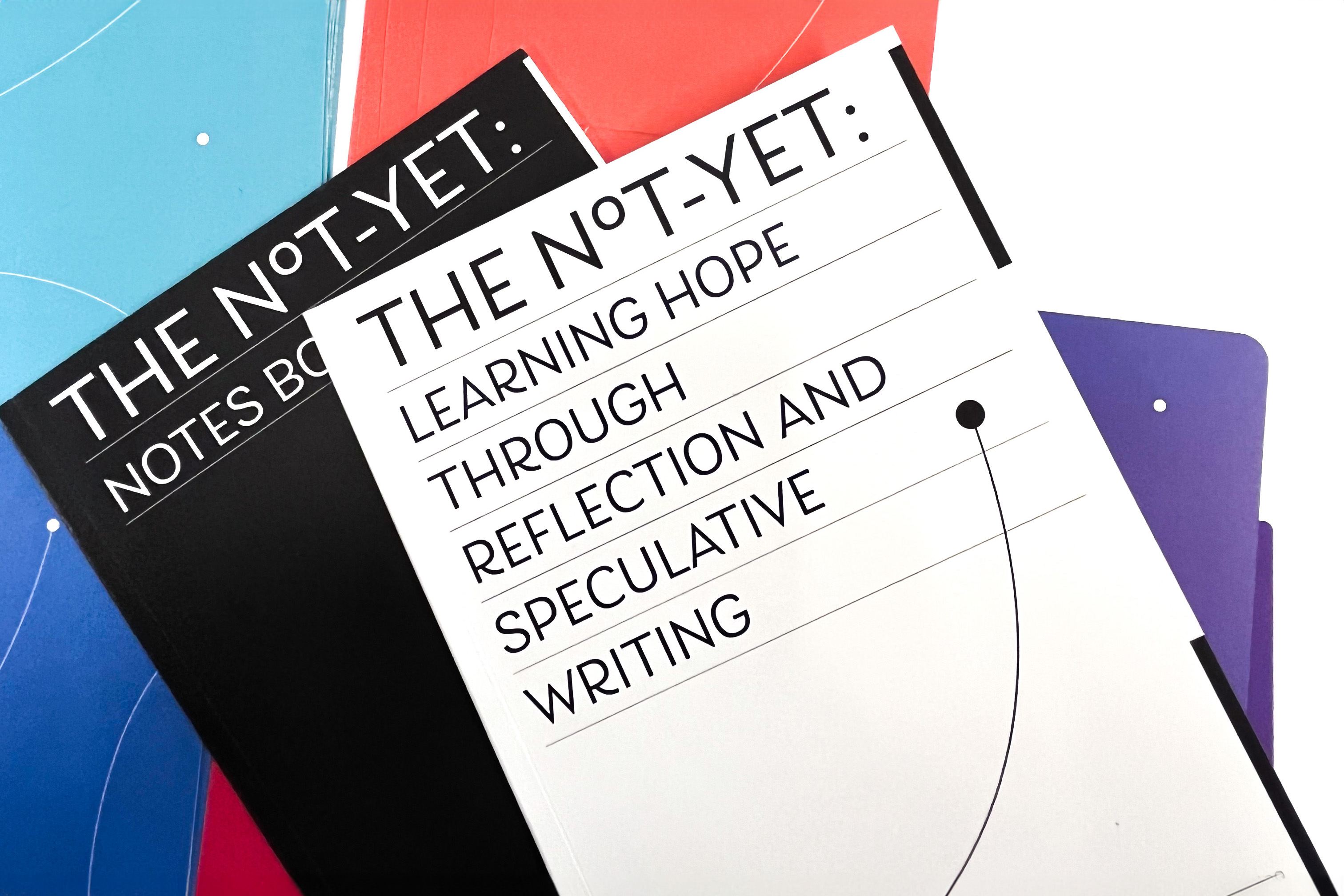
The Not-Yet is a game-like publication that helps people deal with the feeling of hopelessness by imagining their preferred future. I created this project during the graduation period at Willem de Kooning Academy.
I facilitated workshops to gather feedback and improve my method. One of my goals is to start a conversation about learning hope and listen to the participants. Maintaining hope is an essential factor since cynicism does not lead to action in most cases. Uncertainty is scary. Changes happen faster than any time before, so we need to engage in conversations and act accordingly. And I believe this is an important topic to approach through design, and convey ideas in a practical manner.
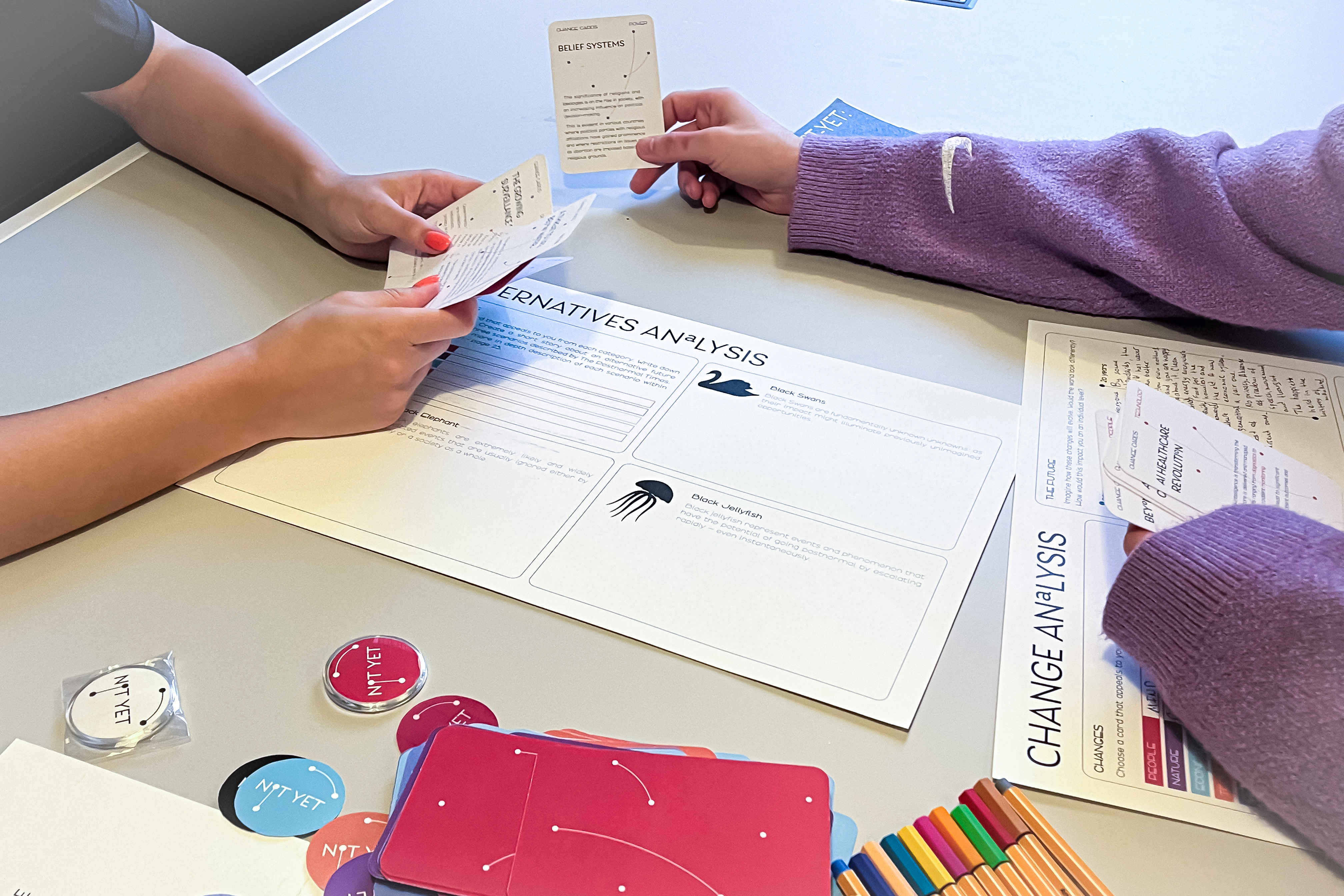
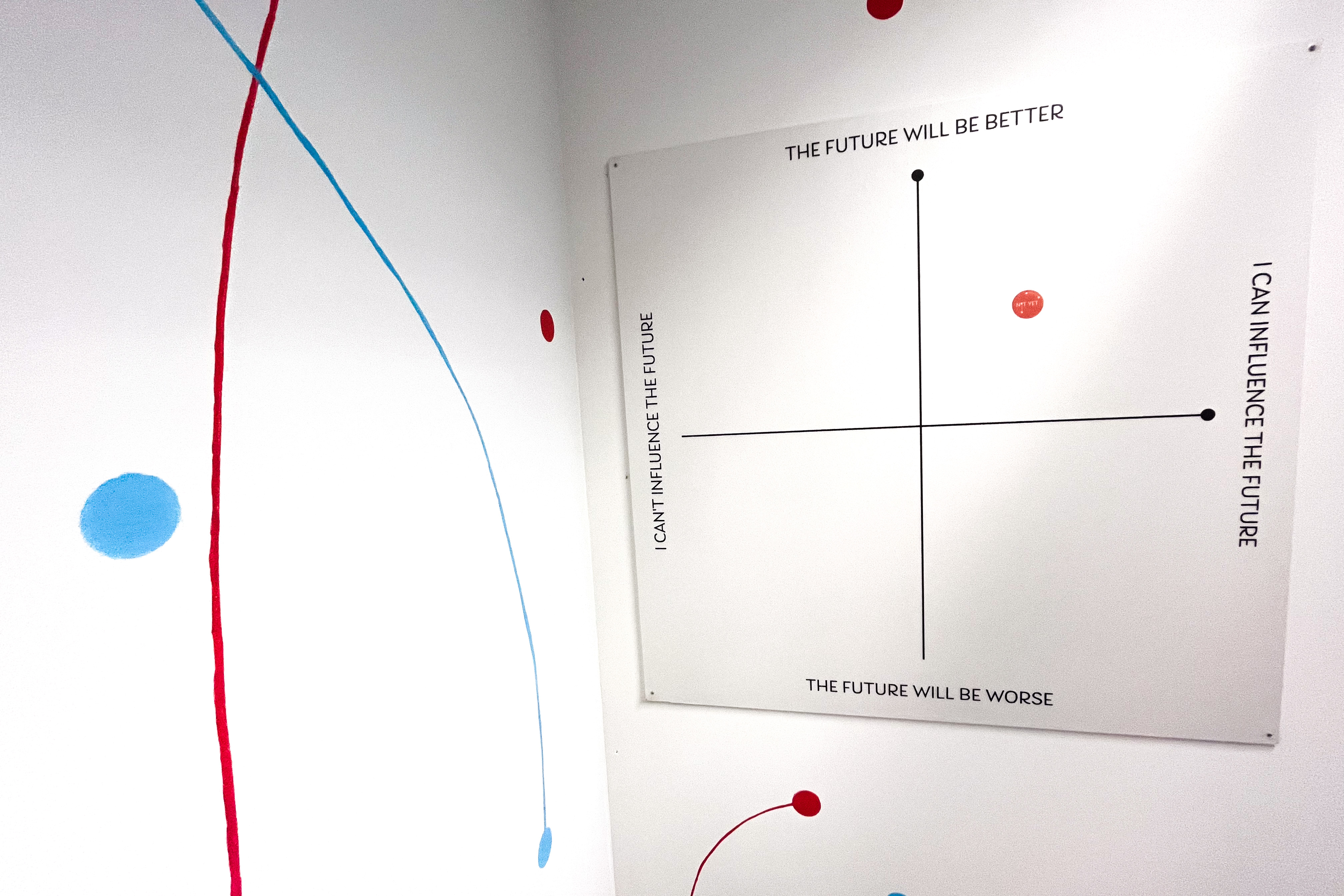
Feel free to contact me if you would like to have a conversation about this project, since I would like to continue to develop it. I can also provide workshops!
Fukushima QR Guide
2021, hybrid publication
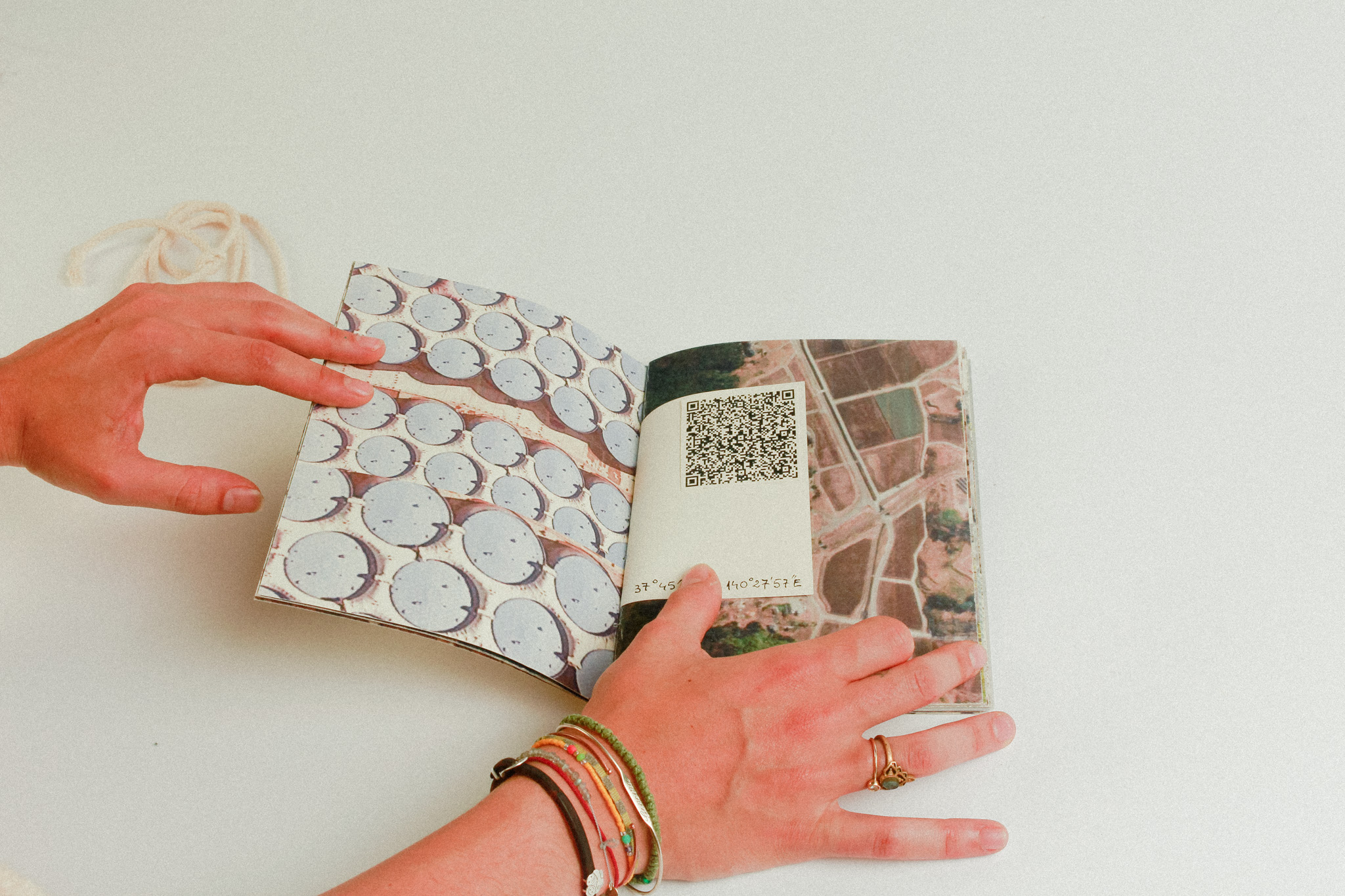
The Fukushima Guide is a printed publication that connects to the online medium through the use of QR codes. I started the project by exploring the streets of Japan through Google Earth, as part of an assignment. I was attracted by natural spaces, parks, signs.
I had this feeling of a private space, as I could not get too close to the nuclear reactor area and the streets looked very similar. I walked around and tried to peek, but all I could see were vending machines at the side of each street. I found out Japan has 23 vending machines per person and realized I can offer the viewer a different experience.
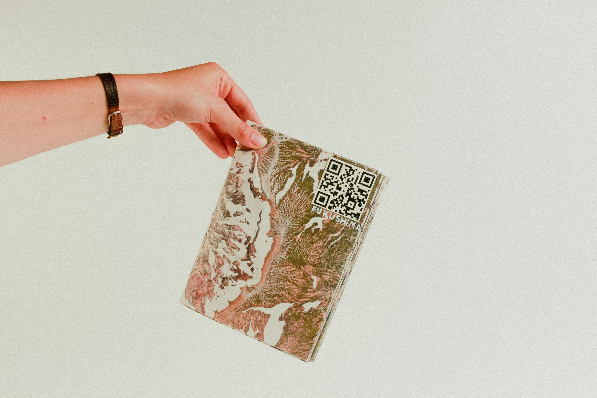
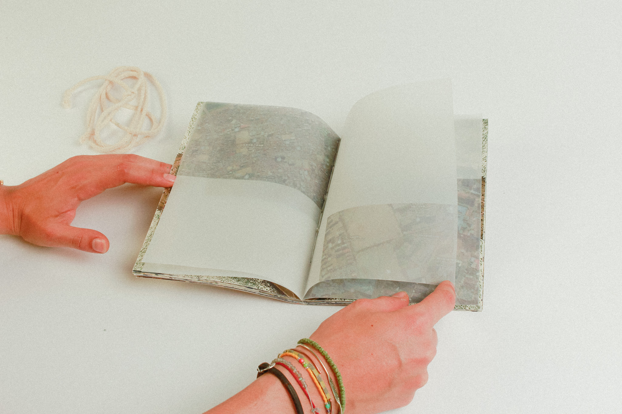
The publication is navigated through the use of QR codes, as each of them takes you to a different vending machine in Google Earth. From there you can start to explore the city, or go to the next QR code.
This was also an opportunity for me to use different materials and printing techniques, adding a tactile layer to the experience. From there, you can move to the digital medium, so it is quite an interesting process of discovering Fukushima.
This was also an opportunity for me to use different materials and printing techniques, adding a tactile layer to the experience. From there, you can move to the digital medium, so it is quite an interesting process of discovering Fukushima.

What? Why? Where? Who?
2022, booklet
The booklet is composed of contemporary events found on the internet. It includes a variety of subjects: from the story of a rat to public events and politics. I decided to organize the pictures by using hashtags, which resembles the internet environment. But still, everything can be found in the same booklet, just like with the chaotic online medium.
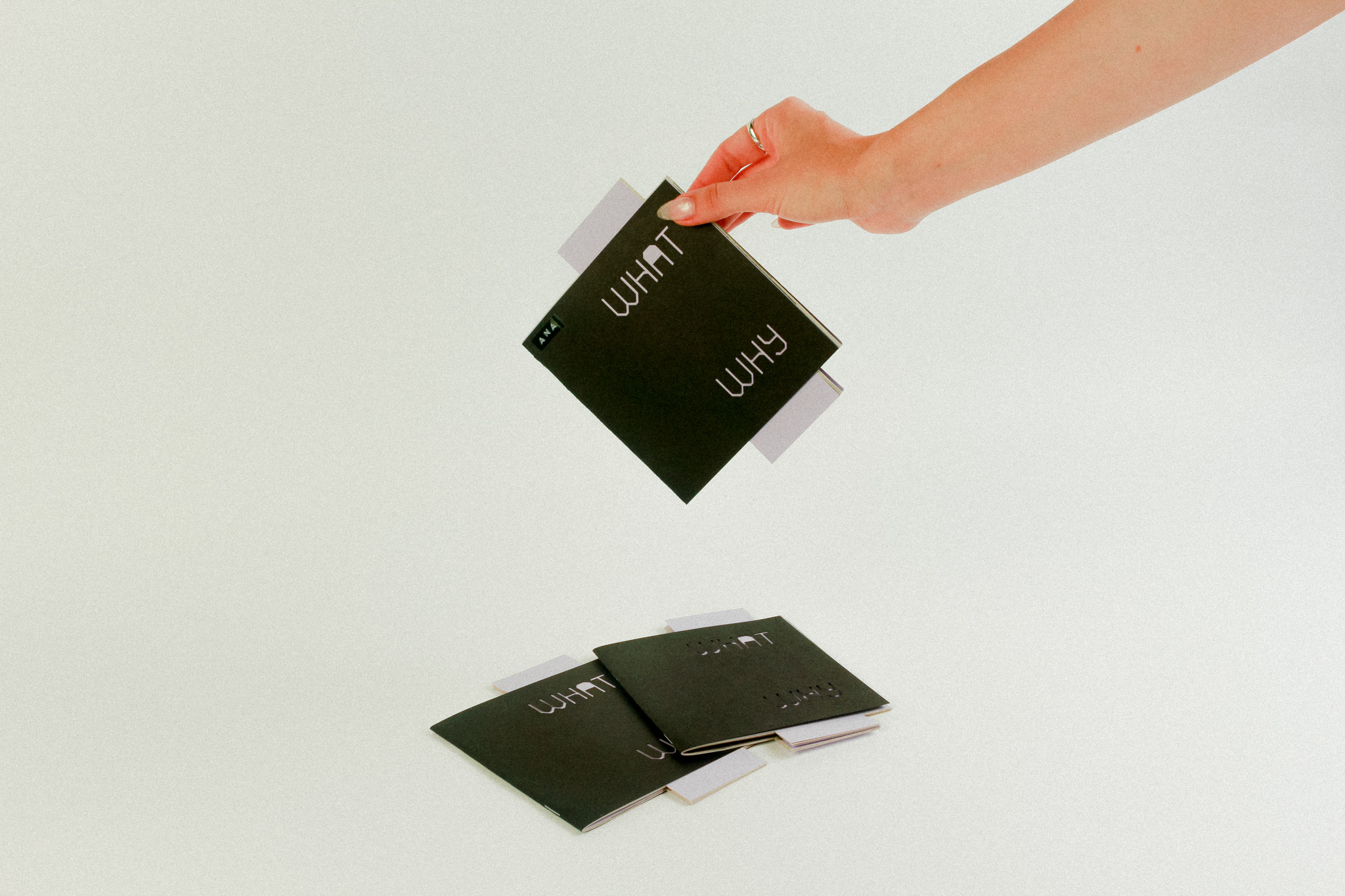
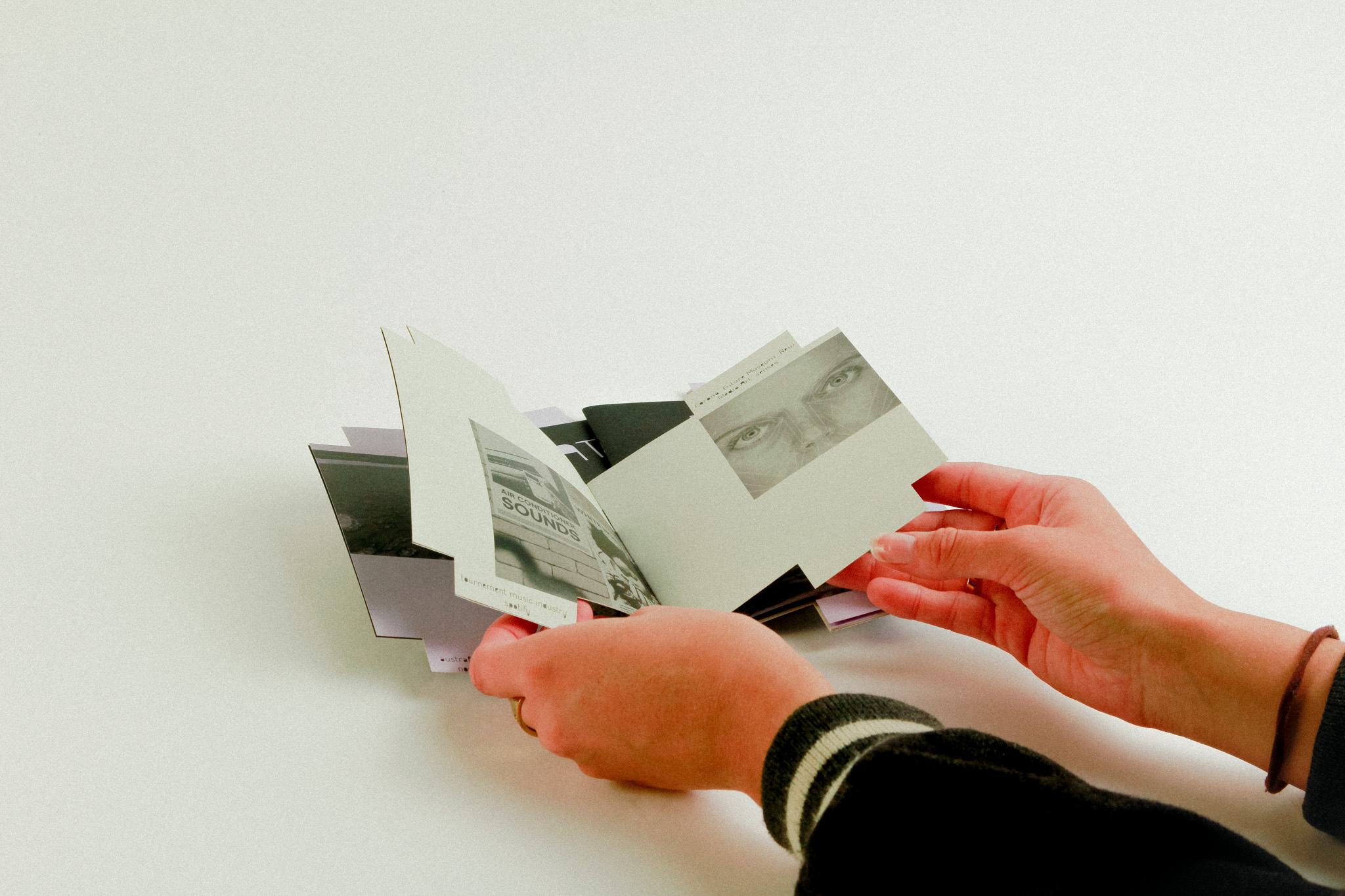
These
hashtags are also sticking out of the cover, just like post-its would. I used a
laser cutter for the absurd title “What? Why? Where? Who?”, which suggests
questioning the reasoning behind articles and information found online.

Truth or Trust
2021, magazine
During my studies at Willem de Kooning Academy, we created an event called “Truth or Trust” on the subject of weaponized design. This is a dark pattern: a deceitful UX design that tries to maneuver people into taking actions they otherwise wouldn't take.
Our goal was to make the strategies used in weaponized design known and warn users of potential consequence. We chose to do this through the printed medium, to remove the participants from the digital space where they are being tricked.
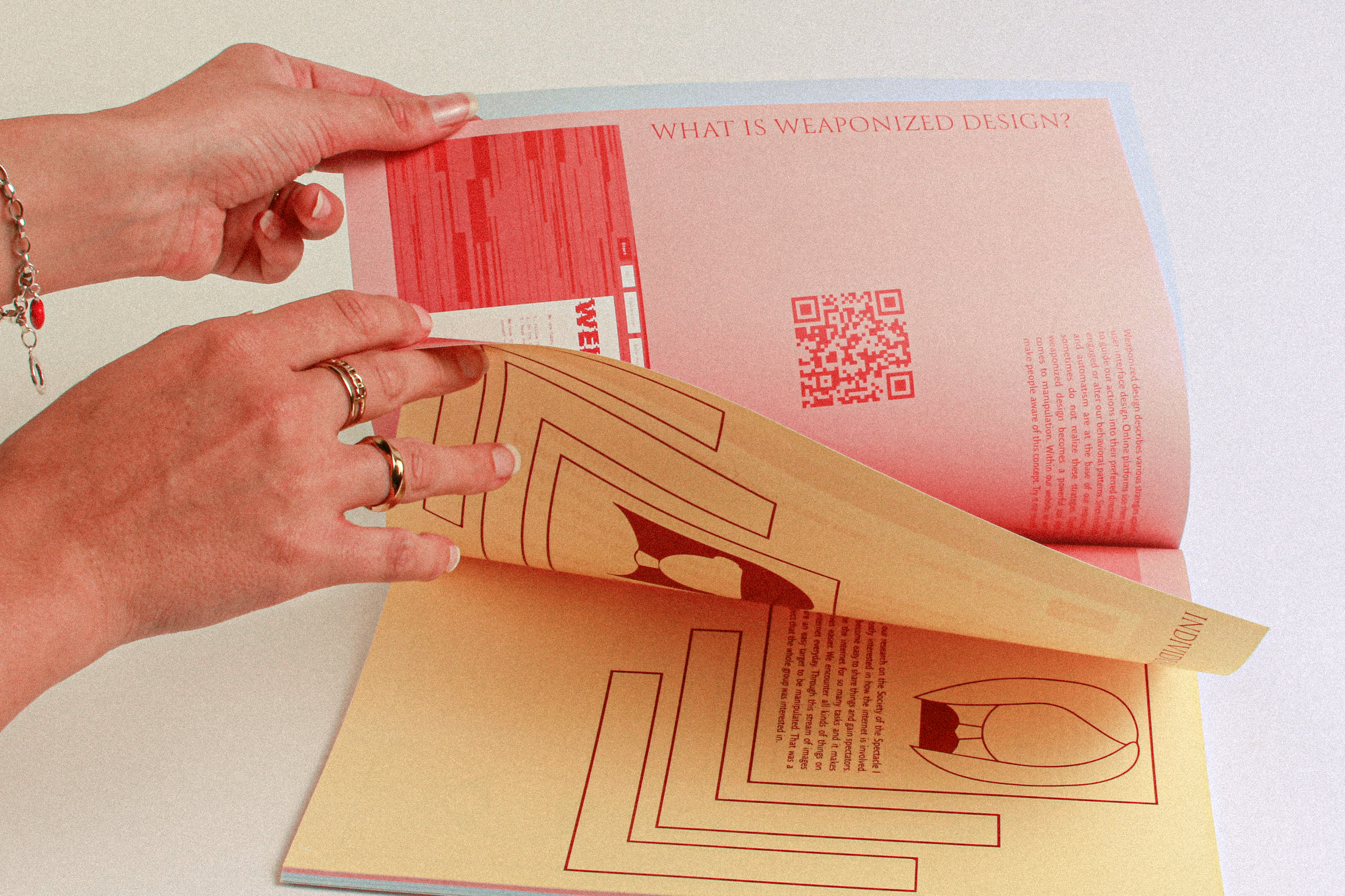

The publication reflects our progress, using different colored pages, duochrome pictures, and QR codes. It was a great opportunity to experiment and create eye-catching combinations. We also included feedback, and reflections in the publications.
