Ana Rugina
Graphic Designer
Rotterdam, NL
︎︎︎ About me
︎︎︎ LinkedIn
︎︎︎ Email
︎︎︎ Instagram
Graphic Designer
Rotterdam, NL
Chiropractitie de Werf
2022, visual identity
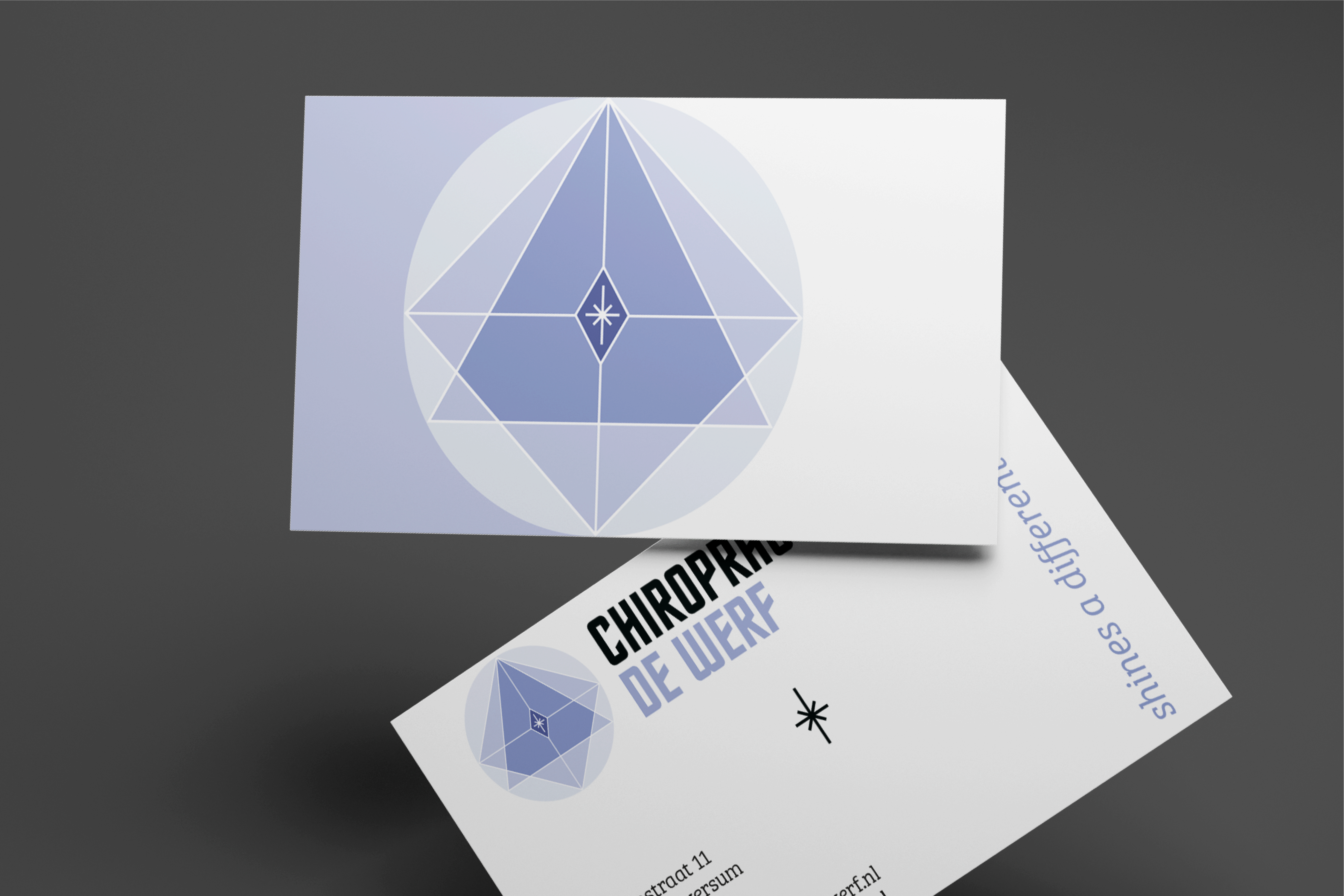
Chiropractie de Werf is a clinique concerned with the diagnosis, treatment and prevention of mechanical disorders of the musculoskeletal system. I created a visual identity for them and designed business cards, envelopes,
prescription forms, and brand guidelines.


The symbol present on the business cards has a spiritual meaning and the owner was keen on having it displayed fully on the materials so that he can explain it. As well, on the business cards you can notice a black star. This would be cut out so that light reflects through it, taking the “Shine a different light” motto to the physical space.
A big part of my role was understanding what the owner wants to communicate to clients and colleagues, so that I can create materials that properly reflects the goals of the healing practice. So sometimes this meant compromising some of my personal preferences to stay close to the purpose.
A big part of my role was understanding what the owner wants to communicate to clients and colleagues, so that I can create materials that properly reflects the goals of the healing practice. So sometimes this meant compromising some of my personal preferences to stay close to the purpose.
